
All About Typography - Font Facts
Welcome to the captivating world of typography and fonts! In the realm of design and communication, typography serves as a powerful tool that goes beyond the mere arrangement of letters and words. Whether you're a seasoned designer or simply curious about the letters that fill our screens and pages, join the experts at SUN as we delve into the nuances of typography.
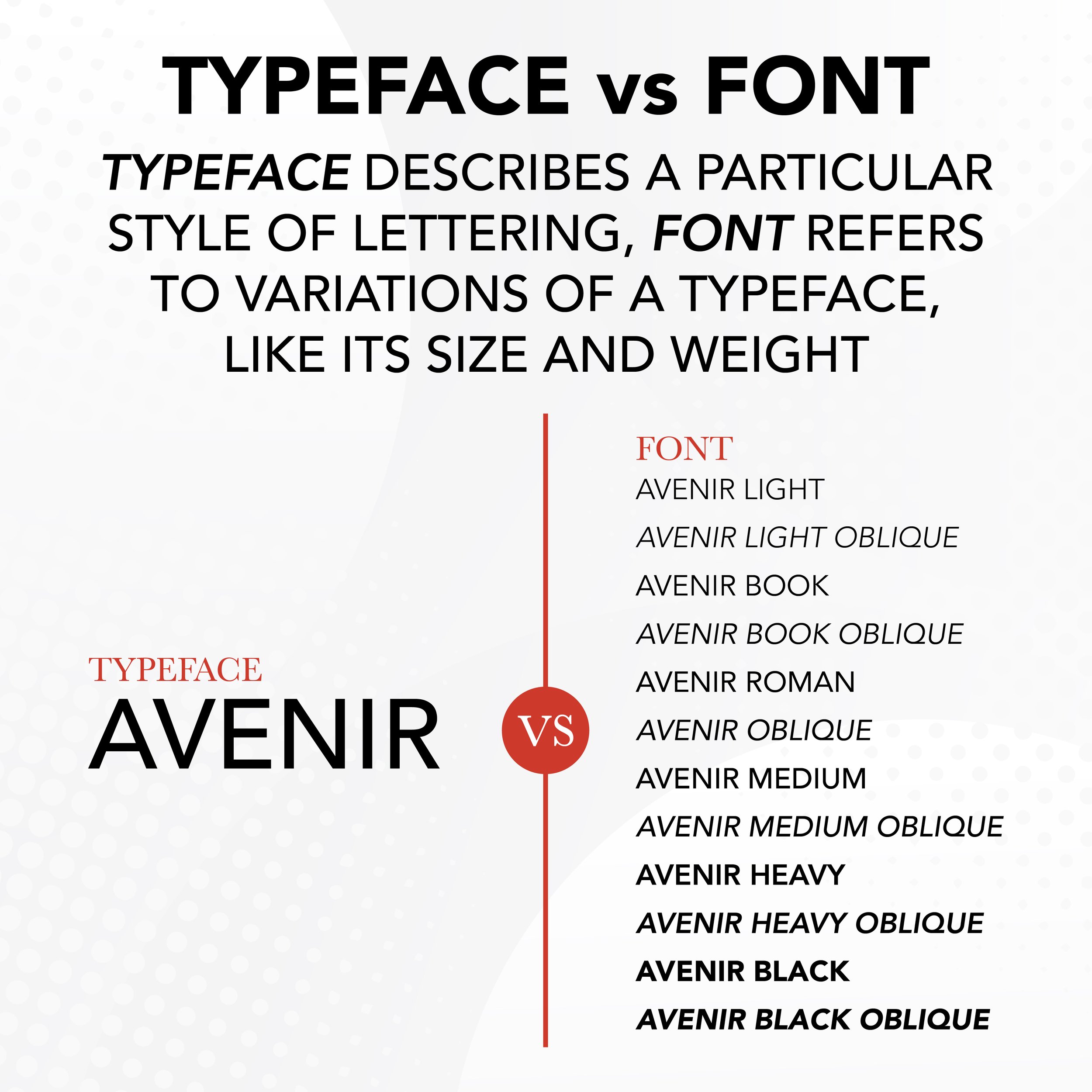
Typeface vs. font
Let’s start by defining what exactly is a typeface and font, and how they differ. A typeface describes a particular style of lettering. Typefaces are a collection of letters, numbers, punctuation marks, and other symbols that have consistent and distinct style characteristics. Examples of these characteristics include letter shape, height, width, stroke thickness, and the presence or absence of serifs. Some examples of well-known typefaces include Helvetica, Arial, Times New Roman, Georgia, etc. Typefaces can have a family of minor style variations, known as fonts. Font versions may be bold, italic, or condensed to help emphasize or differentiate text within a design while still conveying an overall cohesive look and feel. For example, a bold font may be better suited for headings while the regular version works great for body text.
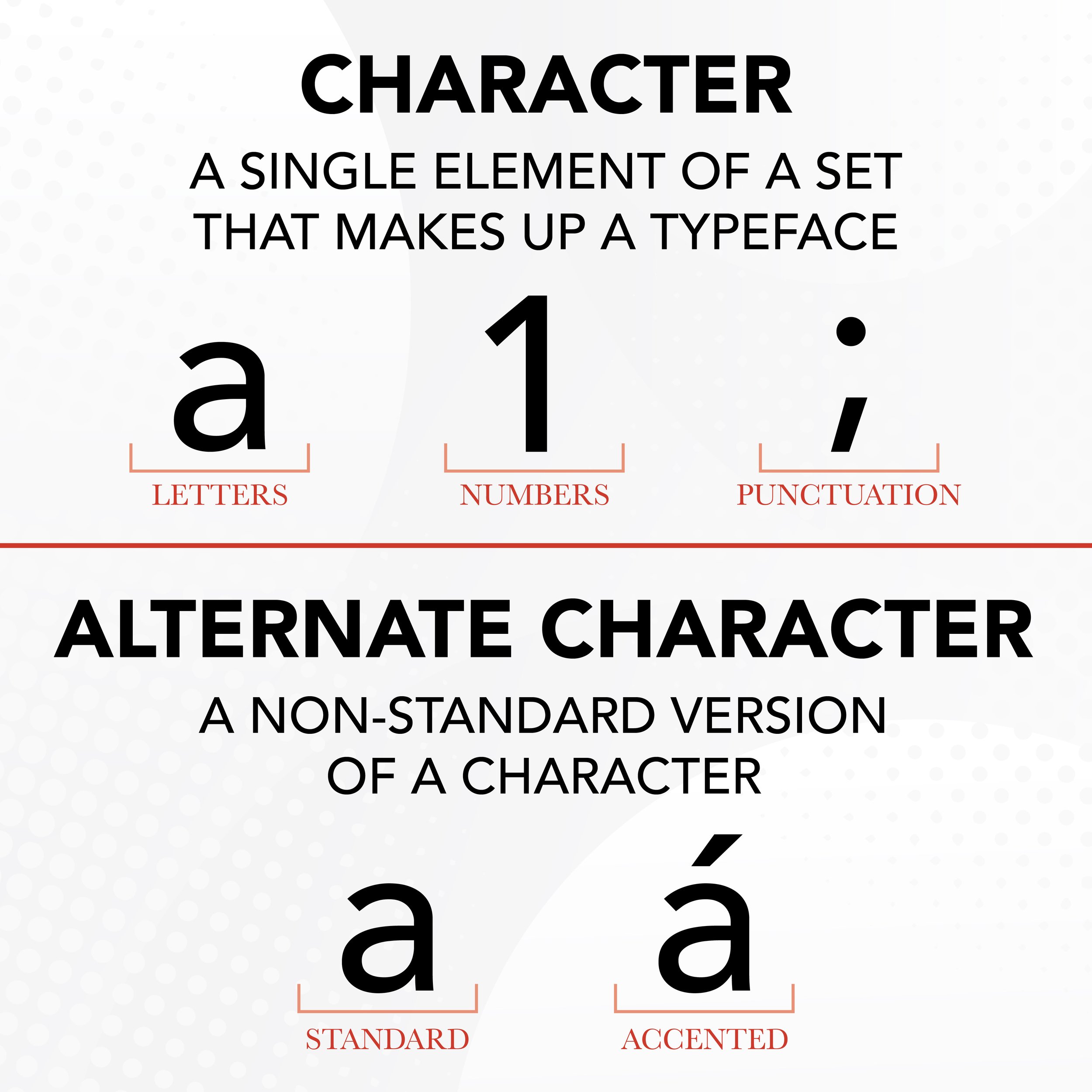
characters & alternte characters
As we previously noted, all typefaces are composed of characters. Characters are a single element of a set that makes up a typeface. Each individual letter, number, punctuation mark, and symbol is a character. In addition to the original characters, some typefaces include non-standard versions of some or all characters. These are called alternate characters, and they may have accents, flourishes, swashes, or serifs that differentiate them from the standard character. Alternate characters are often used in more decorative typefaces and can add a sense of flair and creativity to text elements.

leading
Leading, also known as line spacing, is the vertical distance between lines of text. Normal leading, which most people refer to as “single-spacing” is a standard amount of space between lines of text that is visually pleasing. Tight leading causes lines of text to appear closer to one another, which can make long bodies of text more difficult to read. Loose leading puts more spacing between lines of text, making copy easier to read, but also causing it to take up more room on the page. Sometimes students increase the leading of a document (think essays) to reach a minimum page count without having to type more content. If this is you, don’t worry, most of us have tried this old trick at some point or another. P.S. your teacher does notice.
Tracking & Kerning
Tracking adjusts the uniform amount of horizontal space between characters in a section of text. Most graphics and typesetting programs use a default or “normal” amount of tracking between characters. Designers may increase or decrease the amount of tracking at their will for readability or stylistic reasons. Tight tracking causes letters to appear closer to one another while loose tracking makes them look farther apart. On the other hand, kerning adjusts the spacing between two consecutive characters. Sometimes default spacing causes certain characters to visibly appear closer or farther apart when placed next to one another, even though the space is mathematically the same. Designers often adjust tracking between specific letters to create a more visually appealing and polished appearance. This is common practice for wordmarks, logos, and headings.
In wrapping up our exploration of typography, it becomes clear that these seemingly unassuming elements hold remarkable power in shaping our visual landscape. From grasping the nuances between typefaces and fonts to understanding the impact of leading, tracking, and kerning, we've traversed a realm where design and communication converge. So, the next time you encounter text, whether on a screen or in print, take a moment to appreciate the thought and precision that go into its presentation. And for all the designers out there, remember that beneath every character lies a world of creativity and communication to be explored!